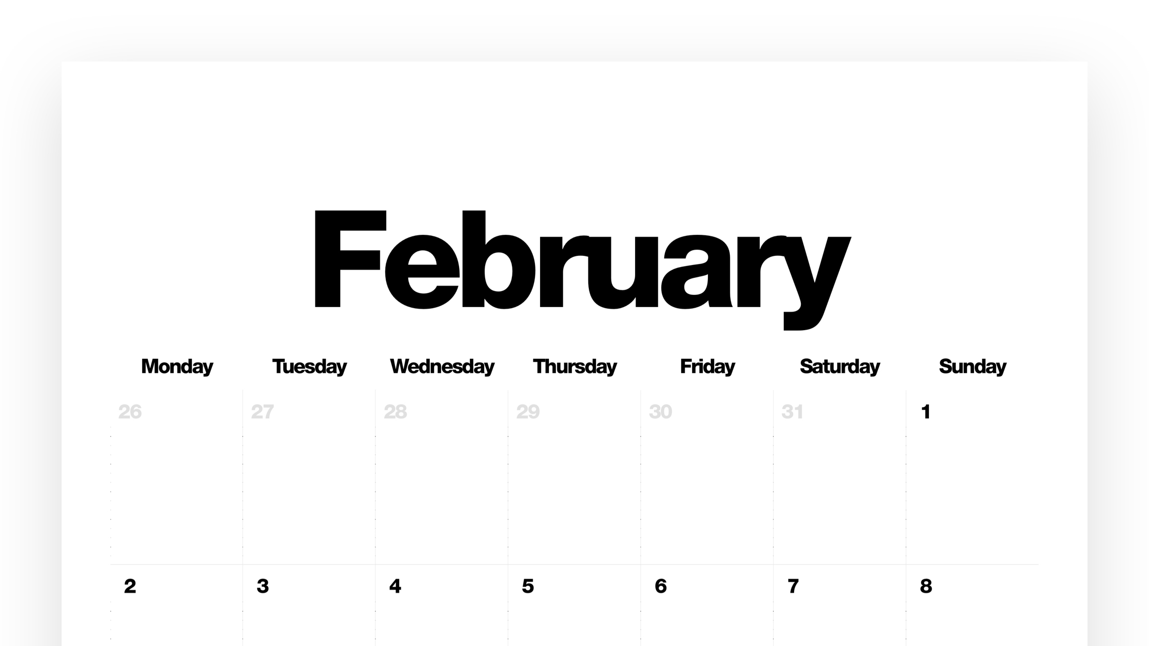
Introduction
A dream written down with a date becomes a goal. A goal broken down into steps becomes a plan. A plan backed by action turns dreams into reality.
With nothing but a bed, a lamp and some clothes, I moved into a literal shoebox of an apartment in Toronto in early 2025. Being in a new city inspired me to go after some big goals: start a new company, make connections in the film industry, and experience all of the wonderful things Toronto had to offer. I quickly noticed that if I wanted to make plans my phone would not be enough. I needed something bigger, something that would hold me accountable and more structured than a standard whiteboard.
In The Bear, there’s a scene where Carmy and Sydney organize every task that they need to complete in order to open their new restaurant. They write post-it notes, gather inspiration images and arrange everything on a large wall planner. The scene is fast, collaborative and works perfectly because everyone on the team can see blocked dates, board and sticky notes. The most notable feature of that planner: every calendar square is sized to fit a standard Post-it note.
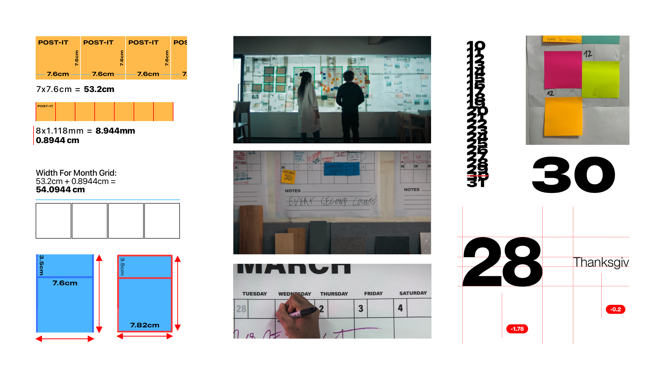
The more I looked at different calendars, I noticed that most planners optimized for size while the space for events was too small and disregarded. As a young designer, I’ve never had the chance to exercise my print design skills and this seemed like the perfect project to start.
A planning surface big enough to think on, visible enough to hold a team accountable, and analog enough that moving an idea means physically moving it. Something that calendar apps simply cannot translate.
Early on, the typical Post-it dimensions of 3" x 3" defined the design process. It became the atomic unit of visual planning for the calendar. I started with rough prototypes, using several sticky notes to estimate the dimensions and decided on the A1 (23.4" x 33.1") paper format.
Process
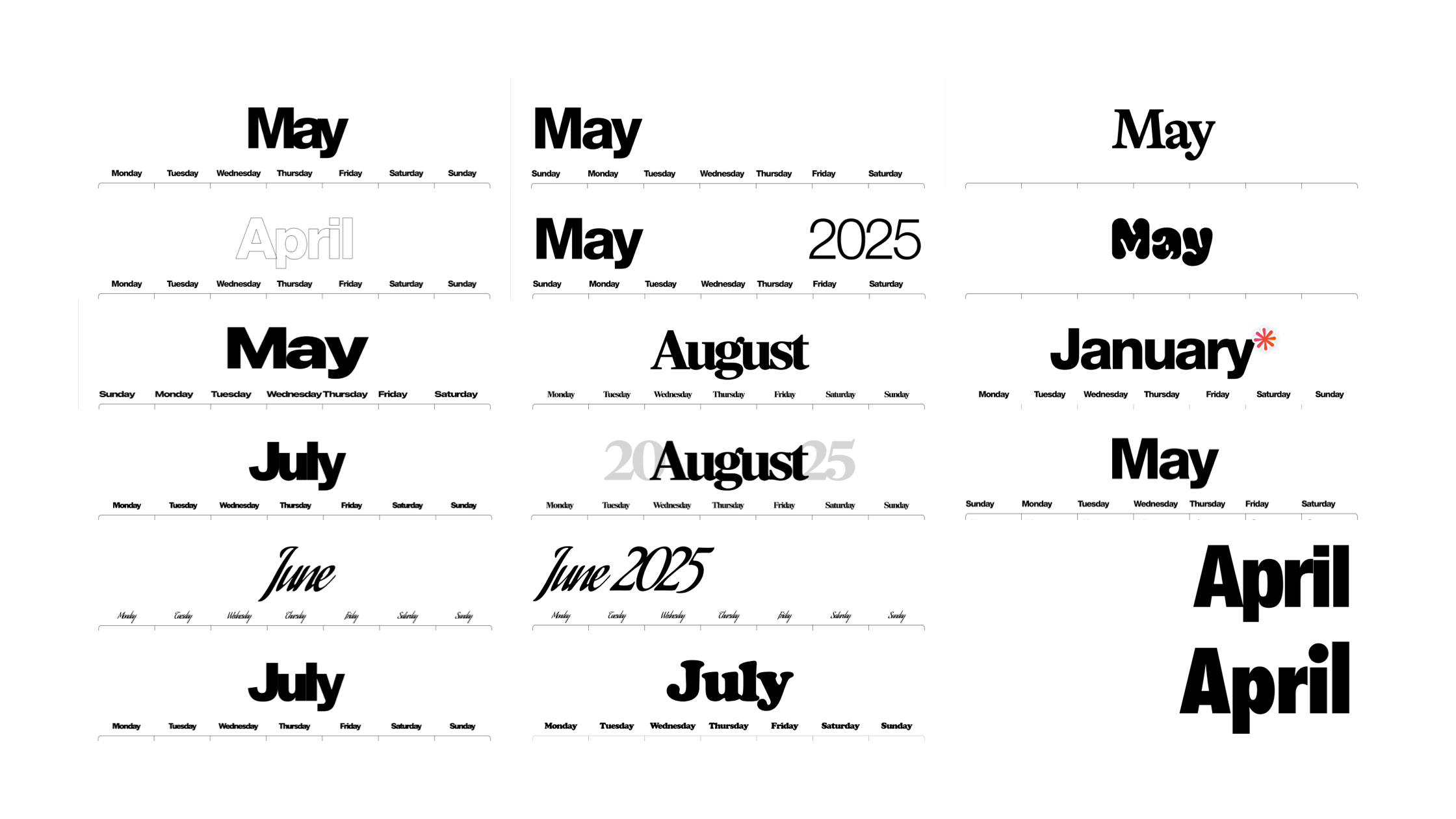
Every millimetre, every inch of this calendar became my obsession. For weeks, I tried to get the exact padding, margin, and font size right. Not by guessing, but by printing over 200 different models and examining them. The biggest challenge was making it aesthetically harmonious. If a letter was too wide or a line too thick, I would immediately spot it and improve it.
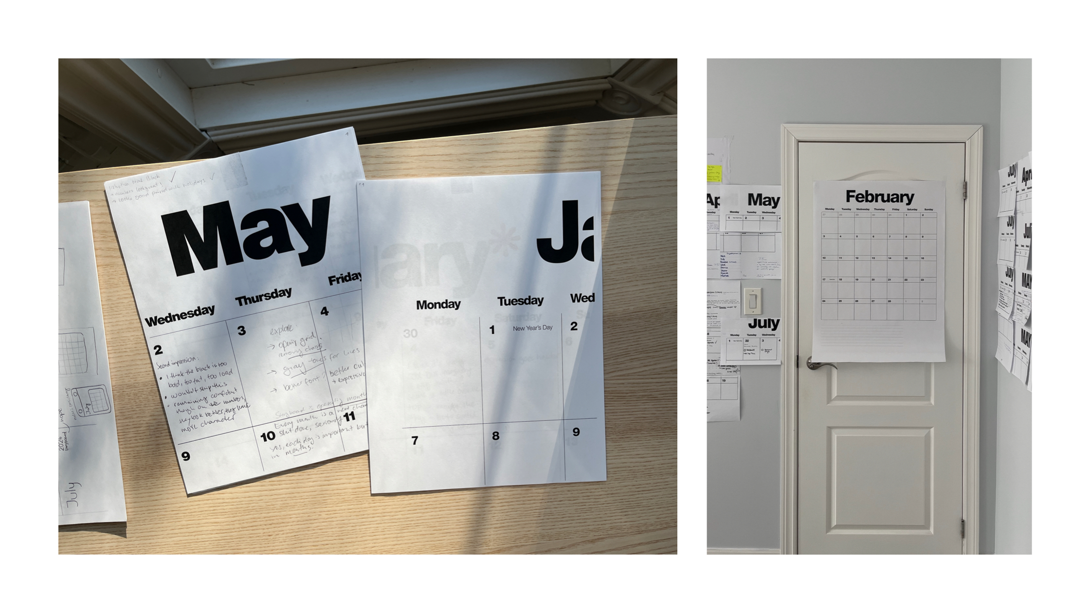
Then I put the calendar to the real test: giving it to busy professionals for feedback. While they hung it up, they never wrote anything on it. The paper felt too premium. People hesitated to ruin it with a pen.
Insight
This was my first lesson: paper thickness determines how people treat it. There was a fine line between paper thick enough to feel like artwork and paper humble enough to invite everyday notes like “team lunch” or “quarterly review”. The challenge became to not just think about what gets printed onto paper, but the paper itself.
Branding
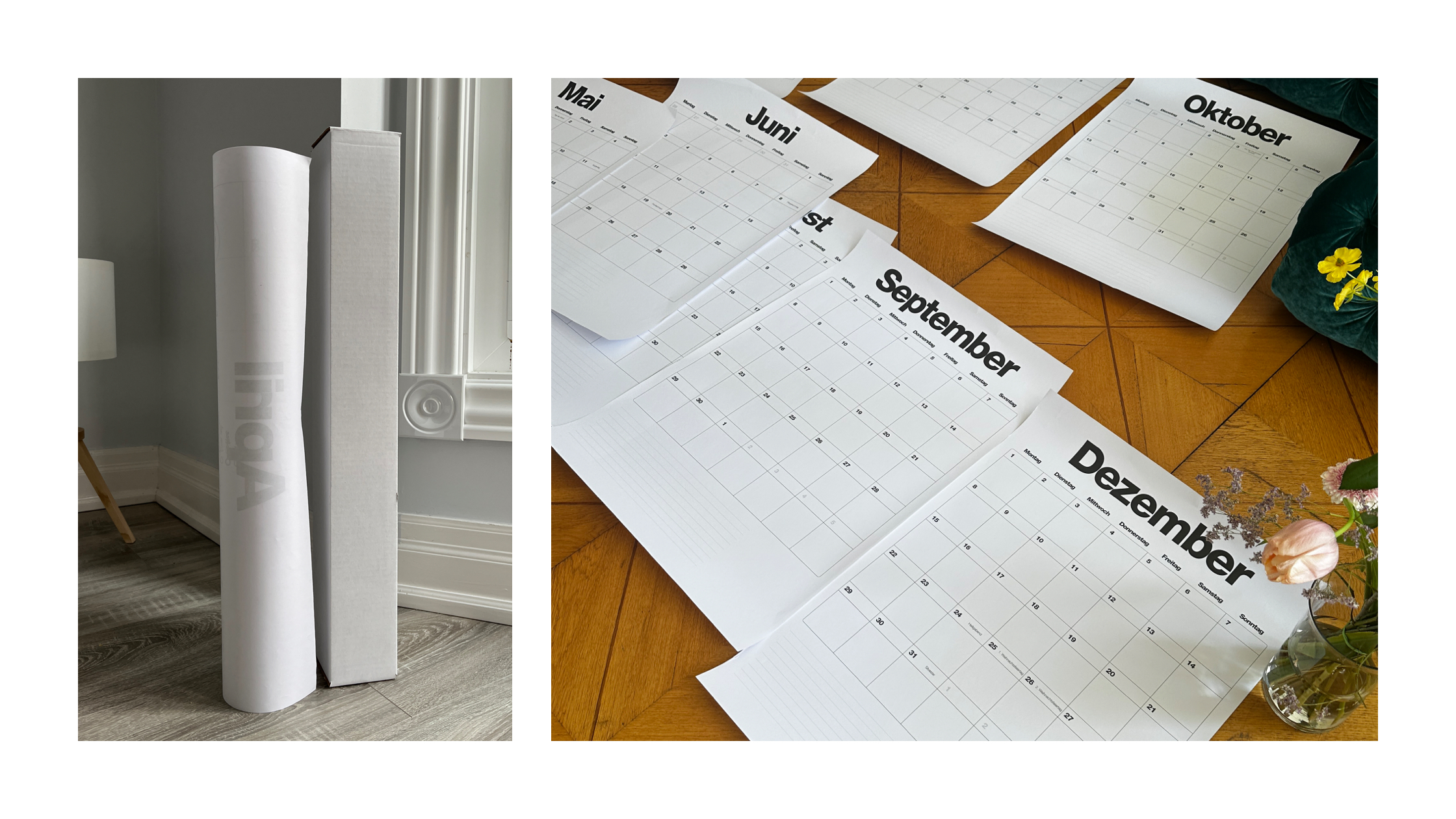
“Don't hope, plan” became the tagline that carried the whole project. Beyond the calendar itself, I spent a significant amount of time designing the wordmark, logo, website, and packaging for rolled shipping. I carried the same design principles throughout: Helvetica Neue, a minimal colour palette, and a focus on utility over decoration.
Legacy
Today, Storyboard continues as a personal project. I'm currently using Storyboard 3, and it has become a foundational part of my everyday life. The biggest improvement was a set of time dots on the vertical lines of the calendar. They mark 12, 3, 6, and 9—like the face of a watch—making it much easier to sketch out appointments and shorter blocks of time without adding visual clutter.
Each year reveals new improvements and opportunities to rethink choices. I’m excited to design and build the next generation of Storyboard as time goes on. And do so with the same passion that started the project: crayday tools with care.